Responsive with CSS Grid
CSS Grid Layout is an adaptable similar to flexbox resource that works in an bidimensional way, similar to table but as an upgrade, it was already explained on a previous article.
Responsive Web Design is about using HTML and CSS to automatically resize, hide, shrink, or enlarge,
a website, to make it look good on all devices: (desktops, tablets, and phones).
- desktops
- tablets
- smartphones
- smart TV
- etc..
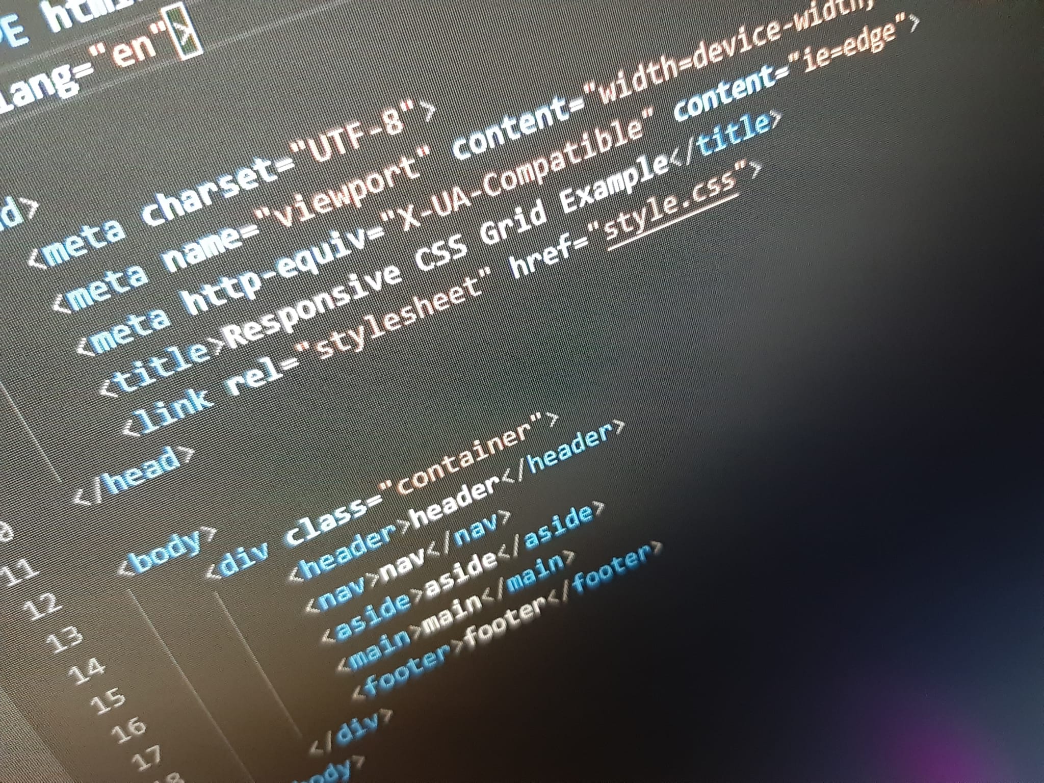
Before trying to understand the code needed or common changes, we need to understand that in the <head> we need to put a special meta <meta>
<meta name="viewport" content="width=device-width, initial-scale=1.0">
We have to take into account that we have another tools to archieve a responsive design, such
as setting max-width or min-width, for
pictures when can even change the source
depending on some conditions with the use of @media, which we'll se
later.
    <picture>
        <source srcset="img_smallflower.jpg" media="(max-width: 600px)">
        <source srcset="img_flowers.jpg" media="(max-width: 1500px)">
        <source srcset="flowers.jpg">
        <img src="img_smallflower.jpg" alt="Flowers">
    </picture>
Therefore, with our viewport setted up, the browser will automatically know how to behave
We also have a unit called vw (Viewport Width) and vh (Viewport Height), which basically gets the viewport current height and width allowing you to work on a more adaptable way, it's how this website is actually built.
Understanding media
The @media in responsive design is the display that you want to focus
on,
screen being the most used, and here's there full list:
- all: used for all media type devices
- print: used for printers
- screen: used for computer screens, tablets, smart-phones etc.
- speech: used for screenreaders that "reads" the page out loud