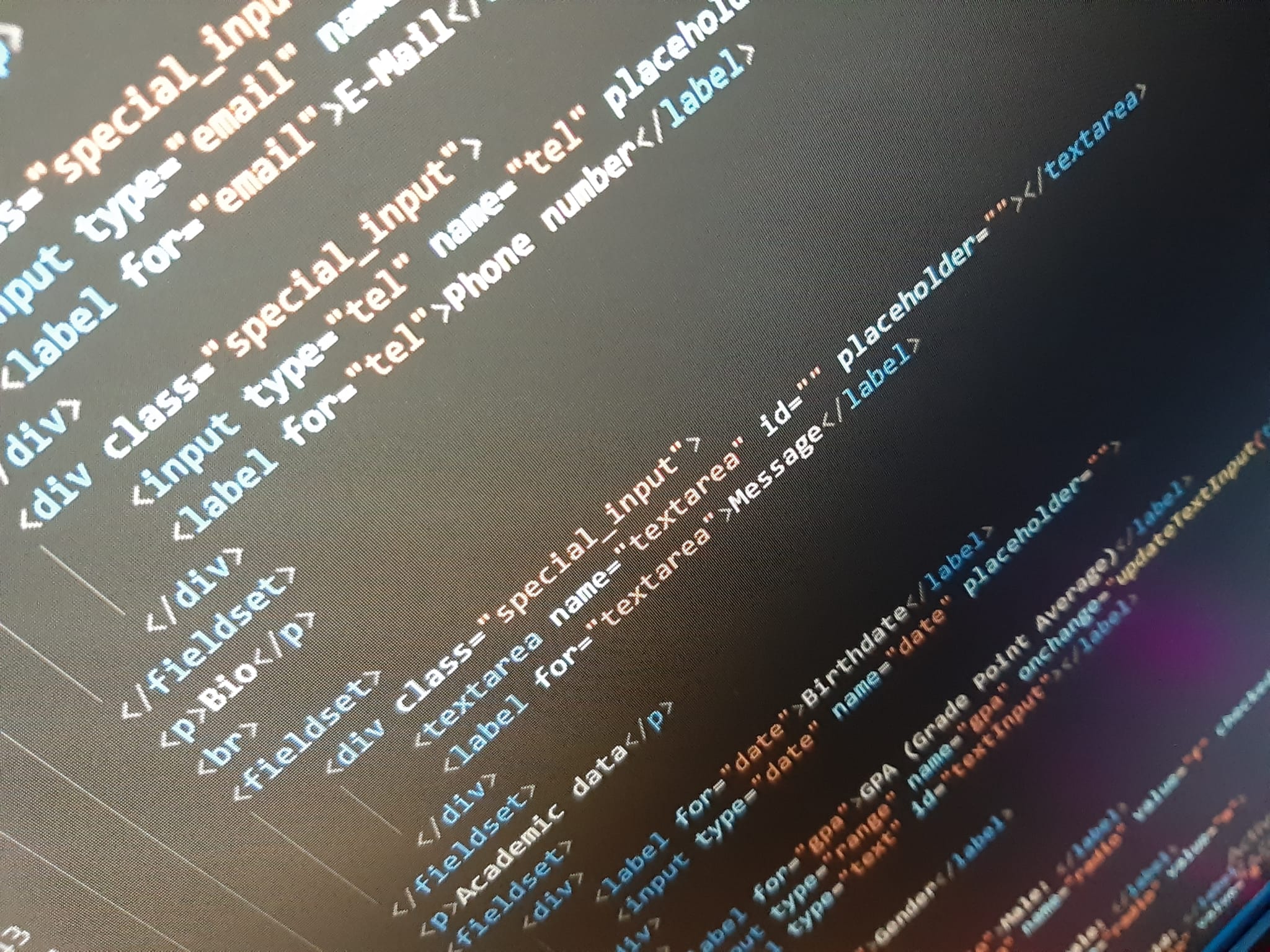
Formulary
A form is an HTML element that is used to collect user input
A form is made of elements, and the form header, let's talk about the form header first.
- actionthe file that will be loaded
- method: POST, more secure, no size limit and GET sizie limit of around 3000 characters and non-secure but can be bookmarked
- enctype="multipart/form-data": this is necessary if we're using input:file and method="POST"
- target: where will the action load on? This allows us to choose
from some options:
- _blank: the response is displayed in a new window or tab
- _self: the response is displayed in the same frame (this is default)
- _parent: the response is displayed in the parent frame
- _top: the response is displayed in the full body of the window
Elements
- input: specifies an input field where the user can enter data
- textarea: defines a multi-line text input control
- button: defines a clickable button, inside a button element you can put content, like text or images
- select: used to create a drop-down list
- option: defines an option in a select list
- optgroup: used to group related options in a drop-down list
- fieldset: used to group related elements in a form, such as inputs
- label: defines a label for a form element
- output: represents the result of a calculation (like one performed by a script)
Related pseudo-classes
Here's a list of some commonly used classes in form elements:
- :focus: when the input is focused
- :placeholder-shown: when the placeholder is shown
- :not(:placeholder-shown): when the placeholder is not shown because is focus or has text
- :active: on-click
- :checked: selects every checked input element
- :disabled: selects every disabled input element
- :enabled: selects every enabled input element
- :in-rangerange : selects input elements with a value within a specified range
- :invalid: selects all input elements with an invalid value
- :optional: selects input elements with no "required" attribute
- :out-of-range: selects input elements with a value outside a specified range
- :read-only: selects input elements with a "readonly" attribute specified
- :read-write: selects input elements with no "readonly" attribute
- :required: selects input elements with a "required" attribute specified
- :valid: selects all input elements with a valid value
Types of Input
You can style inputs of a certain type using CSS selectors to do something like input[type="submit"] so here's a list of every input in the HTML DOM reference:
- Input Button
- Input Checkbox
- Input Color
- Input Date
- Input Datetime
- Input DatetimeLocal
- Input Email
- Input FileUpload
- Input Hidden
- Input Image
- Input Month
- Input Number
- Input Password
- Input Range
- Input Radio
- Input Reset
- Input Search
- Input Submit
- Input Text
- Input Time
- Input URL
- Input Week
