Flexbox
CSS Flexbox is an adaptable resource that works in an unidimensional way by default, there're ways to simulate bidimensionality.
Before the Flexbox Layout module, there were four layout modes:
- Block, for sections in a webpage
- Inline, for text
- Table, for two-dimensional table data
- Positioned, for explicit position of an element
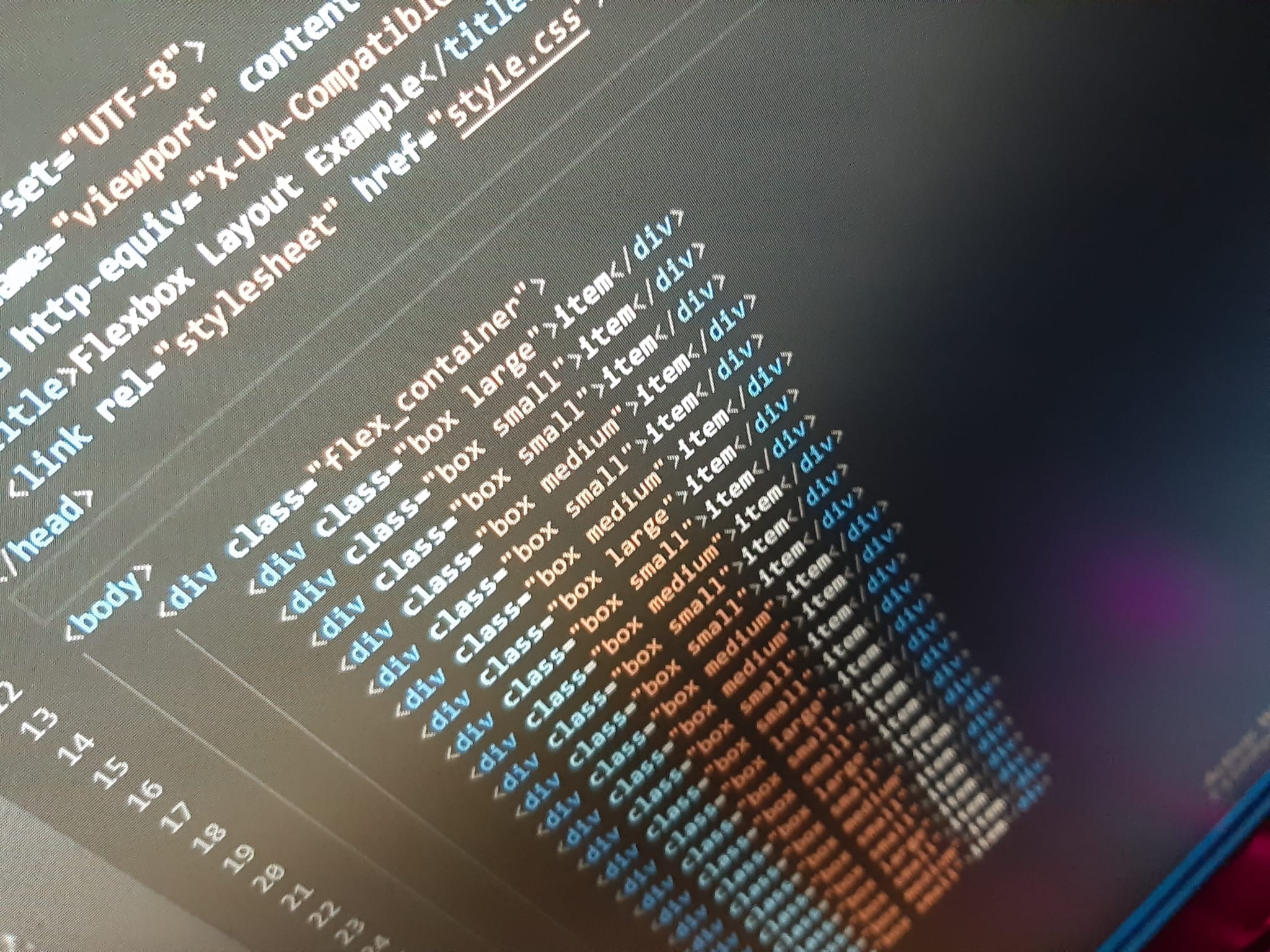
Flex works with a parent element using property display: flex; and direct childs with the property flex: 0 0 auto being:
- flex-grow (optional): the rate at which it will grow if it grows, only with integers, being 0 not sizing
- flex-shrink (optional): the rate at which it will shrink if it shrinks
- flex-basis: from the flex-container what space will it take, auto to take the resting space
The flex container properties are:
Flex-direction
The flex-direction property defines in which direction the container wants to stack the flex items, set to row by default.
- row (default): same as text direction
- row-reverse: opposite to text direction
- column: same as row but top to bottom
- column-reverse: same as row-reverse top to bottom
Flex-wrap
The flex-wrap property specifies whether the flex items should wrap or not.
- nowrap (default): single-line which may cause the container to overflow
- wrap: multi-lines, direction is defined by flex-direction
- wrap-reverse: multi-lines, opposite to direction defined by flex-direction
Flex-flow
The flex-flow property is a shorthand property for setting both the flex-direction and flex-wrap properties.
It is a shorthand for flex-direction and flex-wrap, thus sharing the same values.
Justify-content
The justify-content property is used to align the flex items.
- flex-start (default): items are packed toward the start line
- flex-end: items are packed toward to end line
- center: items are centered along the line
- space-between: items are evenly distributed in the line; first item is on the start line, last item on the end line
- space-around: items are evenly distributed in the line with equal space around them
- space-evenly: items are distributed so that the spacing between any two adjacent alignment subjects, before the first alignment subject, and after the last alignment subject is the same
Align-items
The align-items property is used to align the flex items vertically.
when using align-items and justify-content when the flex-direction is set to column the aforementioned properties will invert their direction too.
- flex-start: cross-start margin edge of the items is placed on the cross-start line
- flex-end: cross-end margin edge of the items is placed on the cross-end line
- center: items are centered in the cross-axis
- baseline: items are aligned such as their baselines align
- stretch (default): stretch to fill the container (still respect min-width/max-width)
Align-content
The align-content property is used to align the flex lines, it works in combination with flex-wrap.
- flex-start: lines packed to the start of the container
- flex-end: lines packed to the end of the container
- center: lines packed to the center of the container
- space-between: lines evenly distributed; the first line is at the start of the container while the last one is at the end
- space-around: lines evenly distributed with equal space between them
- stretch (default): lines stretch to take up the remaining space
Centering
Flexbox can also be used to center elements, or within a flex-container. In the flex-container class there must be the following properties justify-content: center; to center content horizontally and align-items: center; for vertical alignment